“He is clearly using it the wrong way!”
I have seen designers say this, when a user makes a mistake and accidentally deletes all his data. Mostly in all such cases, it is never a users fault. Designers and developers lead users to make such mistakes. If user is taking the wrong action, who is to blame? The user?
We need to understand how users navigate through interfaces we create. It can be summarised somewhat like follows,
- User opens the app/website with some fixed goal in mind.
- User takes a look at the screen, identifying actionable and non-actionable items from his/her past experiences.
- User creates a virtual mind map of possible routes identified controls lead to.
- User creates a complete route with multiple local points that reaches the end goal in his/her mind without even knowing about it. (User virtually uses the whole system before using it in reality.)
- User travels back through all created local points back to start of the route.
- User takes first action, that user thinks will take him/her to next local point in that route and so on.
This complete process can be further divided into even smaller steps which include deciding what kind of control it is, how to use that control etc… It is not much different from the way we navigate in the real world. Think of it as a process of a finding a route to a known location with the help of roadmaps and signs. User is crippled without these hints and markers. Also as we go on increasing number of diversions along the route, user spends more and more time processing and identifying the desired route.
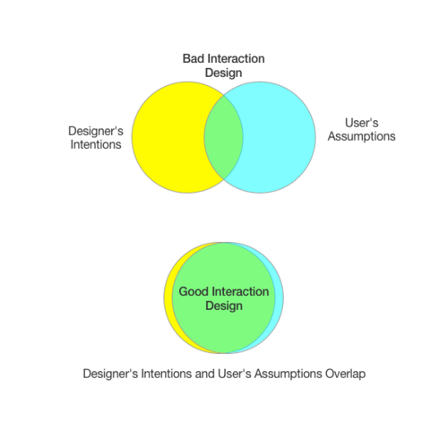
Take a look at the following image specifying intentions of designer and assumption that user makes based on that,

Good design is where the designers intentions largely overlap with the users assumptions. More the overlapping area, better is the understanding user has about the system.
User interactions needs to be well thought. It is important to think in terms of Users mind map while designing interactions. We need to make sure that this mind map matches with the process intended by designers. If the designed interactions do not give helpful clues and hints, users are going to make assumptions based on what they did not understand, and these assumptions are almost always lead users the wrong way.
Creating a good interaction for users
We need to consider few points while creating a better user experience for users via good interaction design,
- Maintain clear structure and hierarchy in design
Structured information is easier to understand and process than information scattered on the screen. Know what is important in your design, group relevant controls together, create clear separation between things which are not related. If required separate out features and create collection of features that user can access on separate screens.
- Don’t reinvent the wheel
People use many interfaces and systems on daily basis. Each system makes use of the signifiers, hints to communicate with the user, May that be colours, sizes or sounds. People are used to these signifiers. They have gone through a very long learning process learning about the natural signifiers. As being designers we should not try to reinvent these signifiers, make use of existing techniques. Making your app/website distinct from other websites doesn’t mean making everything look different. Car wheels are round for a reason, don’t try to make it square.
- Provide immediate feedback
We are living in a period of technical revolution. User expects interfaces to be responsive to their input. When user takes an action, user expects the state of the information to change immediately. Sometimes it is just not possible to have the immediate change of state, in such cases we need to show activity indicators which signify that user input is accepted and being processed. Don’t keep user in the dark, let the user know that it is going to take time, its better than not giving feedback at all.
- Force user to take right actions
Sometimes use of forced constraints is required to keep users safe. There is a reason why we have zebra crossing for people to cross roads. It is a forced function to keep user from taking wrong actions. Actions which may lead system into ambiguous state should be avoided at all costs. These ambiguous state are bad because when error occurs, user has not clue what went wrong and no clue what actions to take.
We can force user to take intended actions by disabling or hiding the actions. Making a use of negative hints is also a good idea to keep user from taking wrong actions. GitHub makes use of this technique very well while deleting a repository, system makes you type in the name of the repository to delete for conformation. This is forcing the user to make correct decision.

Finally, Interaction Design is not just some fancy word, it is a medium of communication between the designer and the user. We as designers need to take that responsibility and know that almost always when user uses the system wrong way, its our fault and not users.
