Distribute and promote your application on the social platform
Fetch user information and photos with Graph API
Display Facebook user profiles and friends list
Learn to use Facebook Graph API and API Explorer
Check user credentials against the Social Platform effortlessly
In Detail
Facebook provides an iOS SDK to third party developers which allows them to develop iOS applications. These applications are then made available on the app store, from which the developers are entitled to 70 percent of sales revenue. Embedding these Facebook iOS SDK features takes applications to the next level of user engagement.
Starting with the process of setting up a Facebook developer account, we will use hands-on examples to walk you through developing and integrating social element like inviting others to use your software. This book focuses on detailing and documenting the process of developing an actual application. Through the course of the book, you will learn to use iOS SDK features in your code flawlessly.
Aiming to simplify the process of embedding Facebook iOS SDK features in your app, each chapter focuses on a new feature, and as you move through the chapters, you will find yourself embedding more functionality in your application. We begin with the creation of a new Facebook App ID before creating and setting up a project. Through the course of the book, you will use social platforms to authenticate users and fetch their social information to make your project more attractive and engaging. The book emphasizes on sharing functionalities, such as inviting friends through Facebook messages with the sole intention of making the app viral. By the end of the book, you will look at how to use the Facebook News Feed to make your app go viral. By the end of the book you will have built a powerful application using the world’s largest social media platform.
Download the Mavericks update, Do not install. (OSX cleans installation files upon installation)
This drive can be used for fresh install of OS X 10.9 Mavericks.
Process:
Insert USB disk and use Disk Utility to erase the disk. This will erase and create a empty disk with name “Untitled”.
Start “Terminal” app, and run following command,
sudo /Applications/Install OS X Mavericks.app/Contents/Resources/createinstallmedia --volume /Volumes/Untitled --applicationpath /Applications/Install OS X Mavericks.app --nointeraction
System will ask you for a password. Enter and wait till the process completes.
WARNING: Improper use of the sudo command could lead to data loss
or the deletion of important system files. Please double-check your
typing when using sudo. Type "man sudo" for more information.

To proceed, enter your password, or type Ctrl-C to abort.

Password:
Erasing Disk: 0%... 10%... 20%... 30%...100%...
Copying installer files to disk...
Copy complete.
Making disk bootable...
Copying boot files...
Copy complete.
Done.
Created by normalizing and indexing video transcript (.srt) files provided for WWDC videos. Check out the app’s source code on GitHub for additional implementation details, as well as information about the webservice APIs made available.
With the release of iOS 7, app designers and developers will need to adjust their visual language to match the new “flat” design of iOS. In addition to the grid system, the dimensions of icons and commonly used elements, typography and iconography has been updated by Apple in many ways.
Many of the times we find ourselves in a meeting room with a team discussing about the product plans. People discuss about existing features, new features, ways to pull more traffic to the site, upcoming SEO processes etc. Everything to make a product more successful and valuable.
How do you measure success or value? Everyone uses different perspectives and merits for measuring these. Marketing team would think of it in terms of total traffic home page is generating, number of likes on social media. Management would think of it in terms of number of registrations, downloads. Anything and everything that gets more traffic and attracts new users. A Team goes on adding “new and exciting” features to make the product stand out. Often adding new features seems like an obvious thing to do, but at what cost?
The team neglects the huge factor about the current users who are using the product, those loyal users who supported the ongoing development of the product. Existing Users who are more than happy about the product and what it offers. Suddenly prospective users become more important than the existing users. Those who were considered ‘masters’ before, become ‘slaves’ the moment they click on the ‘Sign me up’ button.
We need to understand that our role does not end after a user ‘Signs Up’ for a product, it doubles. Users puts faith on our system to do the right thing for them, we as product creators need to respect that. It may sound foolish to think emotionally about the product business, but it is what has been proved correct for long time. End to end experience is more important than the product itself. User base is a great power and it should be handled with greater responsibility.
Expanding the business can be very tricky. It can mean adding new features for existing users or adding new features to target new user base. We can also think of it in terms of redesigning the service to adapt requirements of existing users more closely. Here we have two distinct parameters i.e. feature set and user base, that we need to consider to expand our business. It can be improving existing feature set or adding new feature set, It can be satisfying existing users or specially targeting new users. More often the safest business plans include improving on existing feature set and satisfying our existing user base.
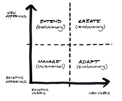
Tim Brown in his book “Change by Design”, talks about the “Ways to Grow” Matrix, developed by Diego Rodriguez & Ryan Jacoby, IDEO.
Here, the idea is not to just focus on single type of business expansion plan but to invest efforts in all possible areas of improvement. This tool was developed to guide businesses manage their portfolios using design based innovation. This tool helps evaluate the innovation efforts within an organisation.
First of all, businesses should invest majority of their efforts into improving existing offerings for existing customers, because this is by far the safest way to expand the business. This means sending out an incremental updates or a next iteration of an existing product. It is very important for a business to invest in existing products and users, as this investment helps create a brand out of a product.
Investment into existing products and users creates a strong foundation for a business. It is important to explore new areas expansions once a strong foundation is in place. It can be achieved either by extending existing offerings to solve the unmet needs of current customers or adapting them to meet the needs of new customers.
Toyota Prius is an example of evolutionary innovation along the product offering axis. Through clever engineering, Toyota offered a new breed of energy efficient transportation, Prius offered significantly lower fuel consumption with fuel increasing fuel prices.
On the similar lines Tata Nano is an example of innovation along the user axis. It involves adapting an existing product so that it can be manufactured at a lower cost and thus exploring a user base of indian families who could not afford a safer family transportation.
The most challenging type of innovation, and riskiest, is that in which both the product and the users are new. Very few companies achieve this great feat successfully. It means creating a whole new market with a ground breaking innovation. Apple did it with iPod & iTunes, in the process helped music industry move with the flow of new technology.
Company’s best defence is to focus on investing their efforts in creating a versatile portfolio and remain competitive in a constantly changing world.
I have seen designers say this, when a user makes a mistake and accidentally deletes all his data. Mostly in all such cases, it is never a users fault. Designers and developers lead users to make such mistakes. If user is taking the wrong action, who is to blame? The user?
We need to understand how users navigate through interfaces we create. It can be summarised somewhat like follows,
User opens the app/website with some fixed goal in mind.
User takes a look at the screen, identifying actionable and non-actionable items from his/her past experiences.
User creates a virtual mind map of possible routes identified controls lead to.
User creates a complete route with multiple local points that reaches the end goal in his/her mind without even knowing about it. (User virtually uses the whole system before using it in reality.)
User travels back through all created local points back to start of the route.
User takes first action, that user thinks will take him/her to next local point in that route and so on.
This complete process can be further divided into even smaller steps which include deciding what kind of control it is, how to use that control etc… It is not much different from the way we navigate in the real world. Think of it as a process of a finding a route to a known location with the help of roadmaps and signs. User is crippled without these hints and markers. Also as we go on increasing number of diversions along the route, user spends more and more time processing and identifying the desired route.
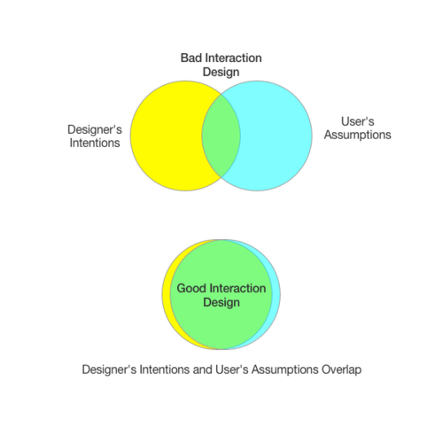
Take a look at the following image specifying intentions of designer and assumption that user makes based on that,
Good design is where the designers intentions largely overlap with the users assumptions. More the overlapping area, better is the understanding user has about the system.
User interactions needs to be well thought. It is important to think in terms of Users mind map while designing interactions. We need to make sure that this mind map matches with the process intended by designers. If the designed interactions do not give helpful clues and hints, users are going to make assumptions based on what they did not understand, and these assumptions are almost always lead users the wrong way.
Creating a good interaction for users
We need to consider few points while creating a better user experience for users via good interaction design,
Maintain clear structure and hierarchy in design
Structured information is easier to understand and process than information scattered on the screen. Know what is important in your design, group relevant controls together, create clear separation between things which are not related. If required separate out features and create collection of features that user can access on separate screens.
Don’t reinvent the wheel
People use many interfaces and systems on daily basis. Each system makes use of the signifiers, hints to communicate with the user, May that be colours, sizes or sounds. People are used to these signifiers. They have gone through a very long learning process learning about the natural signifiers. As being designers we should not try to reinvent these signifiers, make use of existing techniques. Making your app/website distinct from other websites doesn’t mean making everything look different. Car wheels are round for a reason, don’t try to make it square.
Provide immediate feedback
We are living in a period of technical revolution. User expects interfaces to be responsive to their input. When user takes an action, user expects the state of the information to change immediately. Sometimes it is just not possible to have the immediate change of state, in such cases we need to show activity indicators which signify that user input is accepted and being processed. Don’t keep user in the dark, let the user know that it is going to take time, its better than not giving feedback at all.
Force user to take right actions
Sometimes use of forced constraints is required to keep users safe. There is a reason why we have zebra crossing for people to cross roads. It is a forced function to keep user from taking wrong actions. Actions which may lead system into ambiguous state should be avoided at all costs. These ambiguous state are bad because when error occurs, user has not clue what went wrong and no clue what actions to take.
We can force user to take intended actions by disabling or hiding the actions. Making a use of negative hints is also a good idea to keep user from taking wrong actions. GitHub makes use of this technique very well while deleting a repository, system makes you type in the name of the repository to delete for conformation. This is forcing the user to make correct decision.
Finally, Interaction Design is not just some fancy word, it is a medium of communication between the designer and the user. We as designers need to take that responsibility and know that almost always when user uses the system wrong way, its our fault and not users.
We typically use one of the following text search predicates with costs in terms of performance,
Beginwith, Endswith ($)
These are the cheapest queries that are possible in case of text comparisons. In these cases first or last few characters are checked with the text and if the match is not found, code exits.
Equality ($)
We can consider this query as similar to that of Beginswith, which checks all the characters in text.
Contains ($$)
This is bit more expensive as it keeps checking for a match in whole text length.
Matches ($$$)
This is the most expensive query in case of text comparisons, system needs to go through and work with regular expressions engine.
Case and Diacritic Insensitivity [cd] ($$$)
This is a lot more expensive query. Lets first see what does this do. Mentioning [cd] for contains query, treats a, A, à, á, â, ä, æ, ã, å, ā as simply ‘a’. By doing this we are commanding our system not to make difference between all these characters. System has to work a lot to this comparison.
Solution is to use canocicalized Text Seach [n] ($$)
When people search for some text, they type few characters and expect results. What we really need to do here is to use canonicalized text property. To do so we need to separate out the text that will be searched and text that will be displayed. For this we need to convert a display text with diacritic characters into canonicalized text in lowercase. Following code does the magic of converting string into canonicalized string.
kCFStringTransformStripCombiningMarks is the identifier of a transform to strip combining marks (accents or diacritics).
Once we have string that is normalized form of the display text, we can apply text comparison with [n] and pass canonicalized-normalized query text. This saves lot of clock cycles that are wasted in case of case-diacritic insensitive search.
Your UI can not show all the data that exists in the table anyway. Don’t put extra pressure on core data to fetch data what you are not displaying on the screen. Every app has a different requirement for performance. You need to test the performance of your app by experimenting with batchSizes and fetching objects as faults.
If you are not going to update or read managedObject relations, try using NSDictionaryResultType for fetchRequest result type. Specify which properties needs to be fetched.
Use attribute types smartly, don’t use string for all. Numerical operations are always way faster than string operations.
In case of Predicates, always specify numerical predicates before string related predicates. String comparisons eat up way too many clock cycles, numeric comparisons are very fast.
In case of string predicates Beginswith, Endwith are fastest and Contains, Matches are costliest operations. Matches use regular expressions to perform operations.
Data duplication isn’t bad in case of relationships. It makes fetching faster.
While creating to-many relationships, make relation Cascade and Nullify.
In case of Department(to-many)Employee relation, employee to department relation should be Nullify and department to employee relation should be Cascade depending on requirements. What Cascade does is automatically deletes associated employee objects when department object is deleted, Nullify doesn’t delete objects – It breaks the relation between objects and sets relation to nil.
Turn ON indexing only for attributes used in searching, fetching.
Indexing increases insert and update time, larger the number of insertions or updates, more is the time taken for creating indexes.
Make use of multiple ManagedObjectContexts using parent and child relation. (iOS5 onwards)
Parent ManagedObjectContext should be of Concurrency Type NSMainQueueConcurrencyType. This is supposed to be only used for MainThread UI activities. Chile ManagedObjectContext should be made NSPrivateQueueConcurrencyType. Make larger inserts and updates on this context in background and save child context followed by parent context save. Chile context save merges changes into master/parent context and final parent context save actually writes data to sqlite file.
Best way to delete all data is to break the complete Core Data Stack.
To delete all the data, delete the sqlite file. Its much faster than traversing and deleting each object and its relationship.
Use multiple ObjectModels and Sqlite files when required, Its not mandatory to use only one.
If you need to delete partial data (Upon logout or some similar action), its a good idea to physically separate data which needs to be deleted. Just delete the sqlite file when you need to.
Put Core Data Stack code anywhere but not in App Delegate, keep it as a separate object itself if possible eg. VCCoreDataStack.
See what is happening under the hood.
Pass following arguments on launch of the app,
-com.apple.CoreData.SQLDebug 1
Pass argument 1, 2 or 3. Depending on what all data you need to see.
Originally built to be used as a base control for creating photo slide show control. This is a generic control that can be used for any kind of paginated view. Currently only supports horizontal scrolling.
Sherlock: Why are you doing all of this? Moriarty: It’d be so funny. Sherlock: You don’t want money or power, not really. What is it all for? Moriarty: I want to solve the problem. Our problem. The Final Problem. It’s going to start very soon, Sherlock. The Fall. But don’t be scared. Falling’s just like flying except there’s a more permanent destination. Sherlock: Never liked riddles. Moriarty: Learn to. Because I owe you a fall, Sherlock. I. O. U.
Bad Types, not at all readable on the device. Specially Kings XI punjab app!
Almost none of the apps really do follow UI guidelines
F**ked up tab bars
F**ked up control alignments
Ok I understand about having brand colour apps but still like this??? Look at RCB app, I mean really? You really want me to install that shit on iPhone?
I personally think if something needs a walkthrough maybe its time to redesign the interaction. It generally means the app is over-designed, i.e. instead of solving the problem, we are trying to delight the user more.
Ofcourse delighting the user is must, but it should come through better usability and interaction first, and then through UI. I feel by adding walkthrough we try to make user feel that its rocket science, when it really should not be.
Mailbox app gestures originated from app… Clear. Mailbox guys took it one step further. I loved the app at first look and kept it on my home screen but few weeks later, It was clearly failing to satisfy my needs as being ToDo app, I am back to default reminder app, and Clear app is not there on my iPhone anymore. Maybe being a developer, I was amazed with quality and process with which they executed the app, respect for that was the main reason for me to keep that app on home-screen. But it didn’t last long.