Following Apple’s advice and sticking with Model-View-Controller (MVC) design pattern seemed like a good idea at first, but as the app continued to grow, logic that drove some parts of it started to became complex to the point where making changes was accompanied with the feeling of unease and fixing issues in one part of the code with the fear of causing new bugs in some other parts. It would not be fair to blame only MVC for that – of course that some problems are caused by bad programming, lack of experience and the pressure of hard deadlines – but MVC is not well-wisher either. Thinking only in the terms of model, view and controller, one can miss some useful possibilities of how responsibilities can be further separated and dependency graph simplified. In following paragraphs I’ll present a situation where MVC can be improved by expanding it to MVVM
Category: Reposts
A curated collection of intriguing and inspiring articles from fellow internet enthusiasts. This selection is a treasure trove of innovative ideas, cutting-edge thoughts, and diverse perspectives that have resonated with me.
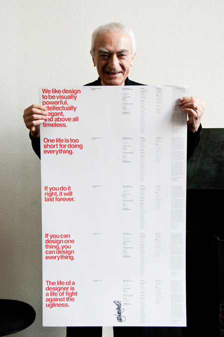
Good Design is About Process, not Product
This is some good shit right here:
“A designer’s process determines the difference between mediocre and great work. Natural talent and training aren’t substitutes for good design habits. The right process can cover many shortcomings of talent and skill — but the opposite is never true. A good process will bring out your best and most unique work. A bad process will leave you with tired, unsurprising clichés.”
The linked article is exactly how I think about design, articulated better than I have ever said it. In my opinion every designer should read this.
Amen.
Three important points about listening to your customers
I’ve known lots of business owners who want to “get some design in here” by hiring a designer. This almost never works because that owner isn’t thinking about design in the right way. Being a design-first company means to actually change the process of product design to one that starts with users actual goals or a known problem and working outward. If you are hitting a wall and hoping a designer can get you out of it, it’s probably not going to work without a fundamental change to your product development process.
Post Flat Design
Wells Rilley talks about how we have lost some of the crucial affordances while shifting our focus on to flat design too fast. Its time to hold on for a while and improve the flat design. Design has a purpose and if that purpose is lost, well its not a design anymore… its a decoration.
The flat movement was born out of a need to get as far away from skeuomorphism as possible. Shadows and metallic sheen were replaced with solid hues and typography-driven design. It was a harken back to the Swiss ‘international style’ of design where strong typography and blocks of color reigned supreme in print.
But perhaps the pendulum swung too far in the flat direction. In the transition to flat we lost some of the helpful affordances – especially on buttons and forms – that more traditional aesthetics used to make our products easy to use. When everything became flat, creating a clear visual hierarchy became a constant challenge.
Can you tell which Shift key is enabled?
Flat has been the predominant visual style for over a year, and some brilliant work has come out of it. But it’s clear that now it’s time to let the pendulum swing back – if even only a little bit.
Query!
Time for Programmers to Grow a Spine
Build something. Build something great. Make it so great that it makes money. Then bring on other people who believe in you and what you’ve built so much that they’re willing to risk for it. Don’t do it only because it makes money, but let money be a reward for bringing more value to your customers. Risk, lose, learn, and then win. It takes guts. It takes a spine. If you haven’t already, grow one.
Mistakes You Should Never Make
Seth Bannon talks about the mistakes he made as a CEO that he shouldn’t have,
- Pay attention to financial operations from the early days. Make a budget.
- Be explicit with your co-founders at the get-go about decision-making, distribution of information, and level of commitment. Formalize this in a written agreement.
- Have conversations with co-founders and teammates when they join about what rules you’re comfortable bending and what hacks you’re comfortable implementing.
- Don’t be a lone wolf. Lean on the experience and smarts of your teammates, investors, and mentors to help solve the tough problems and take advantage of the opportunities.
- If you’re a first time entrepreneur, invite an outside director to sit on your board when you raise money. The upsides greatly outweigh the downsides.
- Keep your investors posted on your progress, be responsive to their requests, and lean on their guidance.
- Be overwhelmingly honest with your stakeholders (team, investors, customers).
- Build a support network of fellow entrepreneurs when the times are good, because when the times are tough their support is invaluable.
The Why and The How of Organizations that Deliver Great Experiences
As companies embrace the need to take user experience seriously, often their first step is to build out a “UX department.” However, the reality is that user experience is a phenomenon that emerges from an entire organization’s activities, not just the efforts of one team. There are (at least) six components that need to be aligned throughout the organisation,
- What do you stand for?
- Where are you headed?
- How do we know when we’re successful?
- How do we encourage desired behavior within the team?
- How do we operate?
- What skills are necessary?
New Programming Jargon
I have never laughed so much while reading programming related stuff.
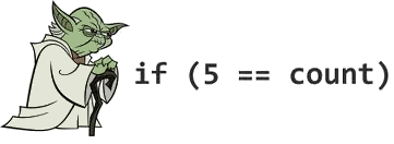
Yoda Conditions
Using
if(constant == variable)instead ofif(variable == constant), likeif(4 == foo). Because it’s like saying “if blue is the sky” or “if tall is the man”.
Interface Moss – The Usability Post
The recent minimalist trends in software design — Metro, flat, iOS7, Material — are attempts to scrape away the moss without a radical alteration in the underlying function. It is a reaction to the friction felt between the old stratum of software that has cemented its implementation and thus could afford to wear a rich visual coat, and a new stratum of software that yearns for a radically different approach to interface design.
It’s OK not to use tools by Jonas Downey of Basecamp
Remember when the web was damn simple? It still can be. It’s up to us to make it that way.
Why ‘Sign Up’ and ‘Sign In’ Button Labels Confuse Users
If you want to give your users a fast and mistake-free login experience, avoid using ‘sign up’ and ‘sign in’ together on your buttons. Instead, make the button labels distinct from each other by using different verbs. There are alternative ways to say ‘sign up’ and ‘sign in’ that mean the same thing. A better way to say ‘sign in’ is ‘log in’. If you want to use ‘sign up’ as a button label, use ‘log in’ with it. The verbs are different and won’t cause as much confusion. However, if you want to make your button labels more distinct than that, use a more descriptive phrase for ‘sign up’.

Read more from the link below…
The Right Way to Ask Users for iOS Permissions
For many apps, not getting access to a phone’s sensors or data can change the entire user experience. For example, if an app depends on where the user is standing, declining access to location could render the app useless. More subtly, if push notifications play a critical role in getting your user to form a habit of using your app, declined access could lead to you losing them forever.
Design Thinking for Social Good: An Interview with David Kelley

What I mean by design is doing things with intention, trying to decide what’s important to somebody, building a bunch of prototypes and showing them around, developing a point of view and getting it out so that it has impact in the world. So design is really a process of making impact on the world by doing this kind of creation of something new to the world and then getting it out there.
1984 Macintosh Introduction
The Original 1984 Macintosh Introduction: the magic moment, when Steve Jobs unveils the Macintosh and releases it from its bag.
Related articles,
http://www.folklore.org/StoryView.py?project=Macintosh&story=Intro_Demo.txt
http://scottknaster.blogspot.in/2014/01/how-lost-mac-intro-video-was-found-and.html?m=1
Can-Do vs. Can’t-Do Culture
As a venture capitalist, people often ask me why big companies have trouble innovating while small companies seem to be able to do it so easily. My answer is generally unexpected. Big companies have plenty of great ideas, but they do not innovate because they need a whole hierarchy of people to agree that a new idea is good in order to pursue it. If one smart person figures out something wrong with an idea — often to show off or to consolidate power — that’s usually enough to kill it.